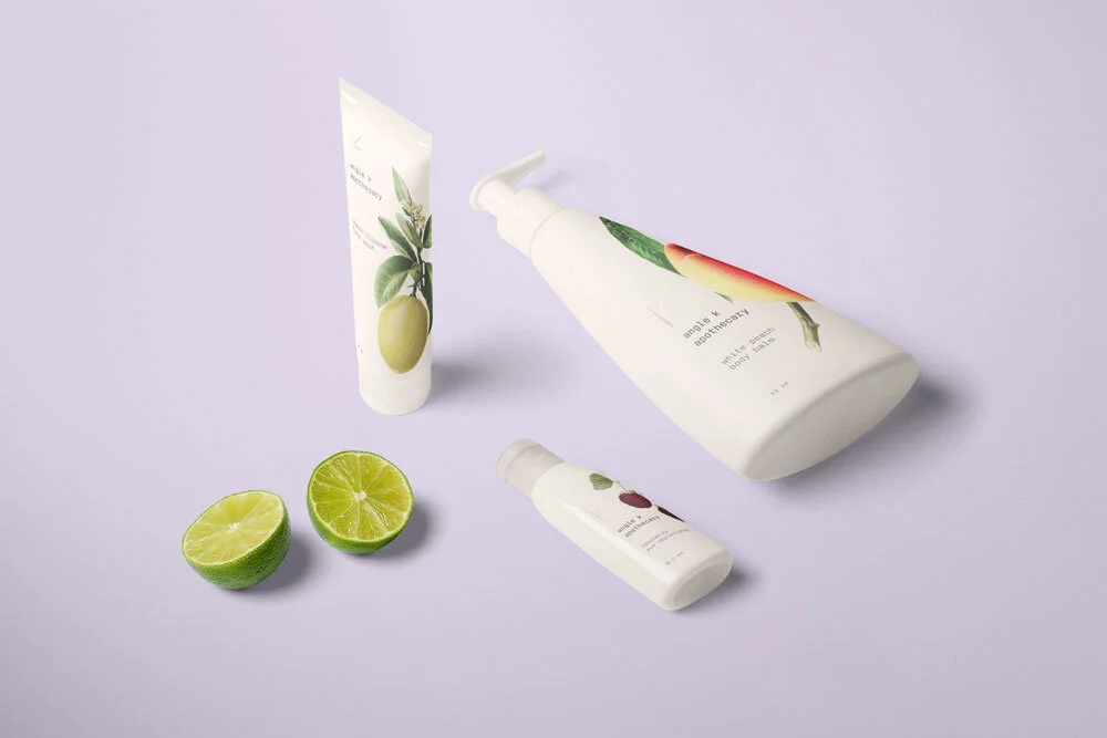
A healingly minimalistic design visually inspired by Kintsugi, the Japenese art of gold mending
The logo takes its shape from the kanji for “under,” honoring the company’s commitment to its organically grown ingredients